Is Civilization VII's UI as Bad as Advertised? A Critical Assessment

Civilization VII's Deluxe Edition launched recently, and online discussions are already buzzing about its user interface (UI) and other perceived flaws. But is the UI truly as problematic as many claim? Let's delve into the game's UI elements and determine if the criticism is justified.
← Return to Sid Meier's Civilization VII main article
Assessing Civ 7's UI: A Detailed Look
Early impressions of Civ VII, especially its UI, have been mixed. While it's easy to join the chorus of complaints, a more objective evaluation is warranted. We'll dissect the UI, comparing it to the characteristics of a well-designed 4X game interface.
Defining a Superior 4X UI
Defining an "objectively good" 4X UI is complex. The ideal UI depends on the game's style, goals, and context. However, common elements consistently appear in highly-rated 4X UIs. Let's use these elements as benchmarks for Civ VII.
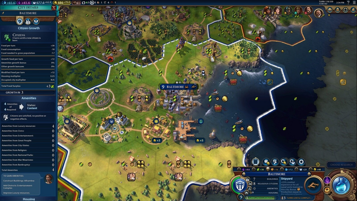
Information Hierarchy: Clarity and Accessibility
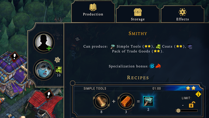
A strong UI prioritizes essential information. Frequently used resources and mechanics should be readily accessible, while less critical features can be nested within a few clicks. Against the Storm's building menus exemplify this: common actions are prominently displayed, while less frequent options are in separate tabs.
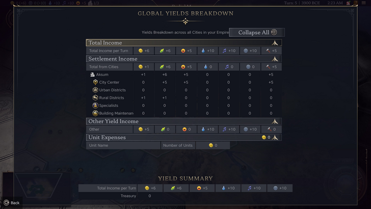
Civ VII's resource summary menu presents resource allocation effectively, separating income, yields, and expenses. However, it lacks granular detail. While overall resource production from rural districts is shown, specific district or hex contributions aren't detailed. Expense breakdowns are also limited. The UI functions, but improved specificity would enhance usability.
Visual Indicators: Efficiency and Impact
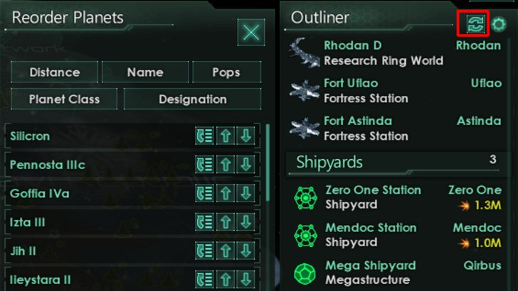
Effective visual indicators convey information instantly. Stellaris's Outliner, despite the game's cluttered UI, effectively uses icons to show ship status and colony needs.
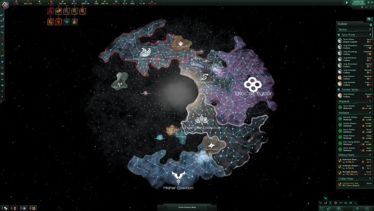
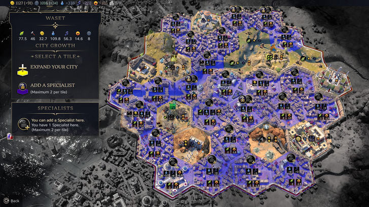
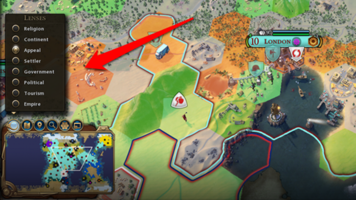
Civ VII utilizes iconography and numerical data for resources. Tile yield overlays, settlement overlays, and settlement expansion screens are visually informative. However, the absence of certain map lenses from Civ VI (e.g., appeal, tourism, loyalty) and customizable map pins is a significant drawback for many players.
Search, Filtering, and Sorting: Streamlining Navigation
In complex 4X games, search, filtering, and sorting are crucial for managing information. Civ VI's robust search function allows players to easily locate resources, units, and features on the map. Its Civilopedia seamlessly links entries to in-game elements.
Civ VII notably lacks this search function, a major usability issue. The absence significantly impacts navigation, especially given the game's scale. This omission is a considerable weakness.
Design and Visual Consistency: Aesthetics and Cohesion
UI aesthetics significantly impact the player experience. Civ VI's dynamic, cartographic style enhances the game's overall aesthetic.
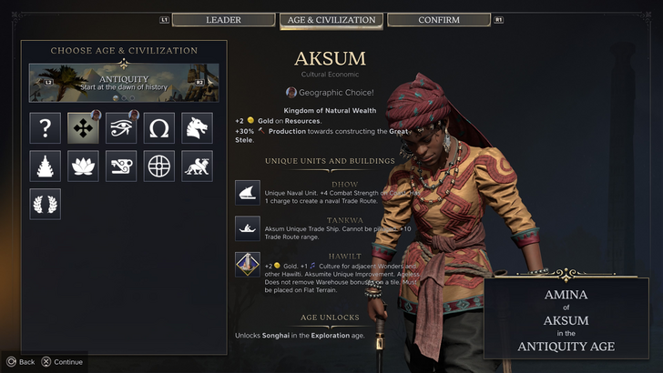
Civ VII adopts a minimalist, sleek design. The color palette (black and gold) is sophisticated but less visually striking than Civ VI. The subtler thematic direction may not resonate with all players, leading to mixed opinions. Ultimately, visual design is subjective.
Final Verdict: Not as Bad as Claimed
While Civ VII's UI isn't perfect, it's not as disastrous as some suggest. The lack of a search function is a significant flaw, but not game-breaking. Compared to other issues, the UI's shortcomings are relatively minor. While it may not match the visual appeal or efficiency of other 4X UIs, it possesses strengths. With updates and player feedback, it has the potential to improve significantly.
← Return to Sid Meier's Civilization VII main article
Sid Meier's Civilization VII Similar Games